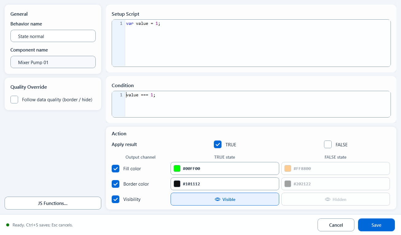
State Color is the simplest color behavior under Visual States, built for components that have exactly two states. You write one condition; when it is true the component takes one set of styles (fill, stroke, visibility), when false it takes the other. It does not handle numeric ranges or priority among many states; that is what Range Color, Discrete Color, and Multi-State Color are for. When a shape is fundamentally yes/no or on/off, State Color is the cleanest and least error-prone choice.
Colors
Colors: State Color
A visual-state behavior for strict two-state components: when the condition is true the shape takes the True style, when false it takes the False style, each controlling fill, stroke, and visibility. Best for run/stop, open/close, auto/manual.
What it is and what it's for
State Color is the simplest color behavior under Visual States, built for components that have exactly two states. You write one condition; when it is true the component takes one set of styles (fill, stroke, visibility), when false it takes the other. It does not handle numeric ranges or priority among many states; that is what Range Color, Discrete Color, and Multi-State Color are for. When a shape is fundamentally yes/no or on/off, State Color is the cleanest and least error-prone choice.
How to use it: fields in its editor
Drag State Color from the right panel onto a component node to bind it, then double-click to open the editor. Read tags and prepare values in Definition, return a boolean from Condition, then configure the True and False style blocks.
Definition: prep area to read tags and define variables. e.g. var running = ReadTagInteger("PLC1.PUMP.RUN", 0);
Condition: the final expression returning true/false. e.g. running === 1;
Apply When True / Apply When False: whether the matching style set is applied when the condition is true / false (False is off by default; turn it on only when needed)
True State / False State: two independent style blocks, each with the toggles below
Enabled: whether this state block takes effect
Fill: enable FillEnabled, then set FillColor
Stroke: enable StrokeEnabled, then set StrokeColor
Visibility: enable VisibilityEnabled, then toggle visible / hidden to show or hide the component in that state
// Definition
var running = ReadTagInteger("PLC1.PUMP.RUN", 0);

// Condition
running === 1;
// True state: fill #00FF00 (green) -> running
// False state: fill #FF8800 (orange) -> stopped
When to use it
Use it whenever a component has exactly two clear states that should be distinguished at a glance by color or visibility.
Pump/motor run lamp: running = green, stopped = grey/orange
Valve open/close state: open = green, closed = red
Auto/manual or local/remote two-state markers
A boolean alarm block: shown and red when active, hidden when normal
Boundaries and common mistakes
Two common traps. First, if you configure only the True style, nothing changes when the condition is false; because both the False State's Enabled and Apply When False are off by default, so you must turn them on when you need a distinct false appearance. Second, State Color has no Quality Border option, so it gives no warning when tag quality goes bad; if the site needs a fault indication on communication loss, use a behavior that supports Quality Border instead (Script Color, Discrete Color). Also, Condition must return a boolean, not a numeric range (that is Range Color / Discrete Color).
Figure 1: State Color editor
Write the condition in the editor and configure two style sets - fill, stroke, and visibility for the true and false states.