The Behavior Browser is the most-used screen in the plugin. It has three panes: the left tree (Pages / Components) lists pages, components, and the behaviors already bound to them; the right catalog (Behaviors) lists the behaviors you can bind; the bottom is Behavior Details. The only way to bind is to DRAG a behavior from the right catalog onto a component node in the left tree; double-clicking a behavior on the right does NOT bind it.
What it is and what it is for
The Behavior Browser (ribbon HQ VISU tab -> Behavior Browser) is the visual pane where you attach run-time behaviors to the shapes on your PPT page. It is the screen you will use most. The layout is fixed into three panes. The left tree, Pages / Components, shows the hierarchy: pages, the components on each page, and the behaviors already bound under each component (the active page or component is highlighted). The right catalog, Behaviors, lists every behavior you can bind, grouped into four categories: Visual States (color, border, show/hide, status lamps), Geometry (move, rotate, scale), Interactions (click, hover, navigation, write value), and Text (text display). The bottom pane, Behavior Details, shows details for the node you have selected. In short: this is where you decide how a shape should change on the live screen, and what happens when it is clicked.
Current behavior catalog: 22 registered behaviors
This list comes directly from the current program registry. The manual uses these user-facing names; legacy labels and internal type values remain compatibility details rather than new configuration entry points.
- Visual States: Blink Color, Range Color, Script Color, Discrete Color, State Color, Multi-State Color.
- Geometry: Move, Rotate, Scale.
- Interactions: Set Variable on Click, Open Diagnosis, Open Link, Open Page as Popup, Close Current Popup, Write Tag, Write Tag Bit, Click Script, Hover Script, Press/Release Script.
- Text: Script Text, Tag Text, Localized Text.
How to use it: drag to bind + right-click menu + editor fields
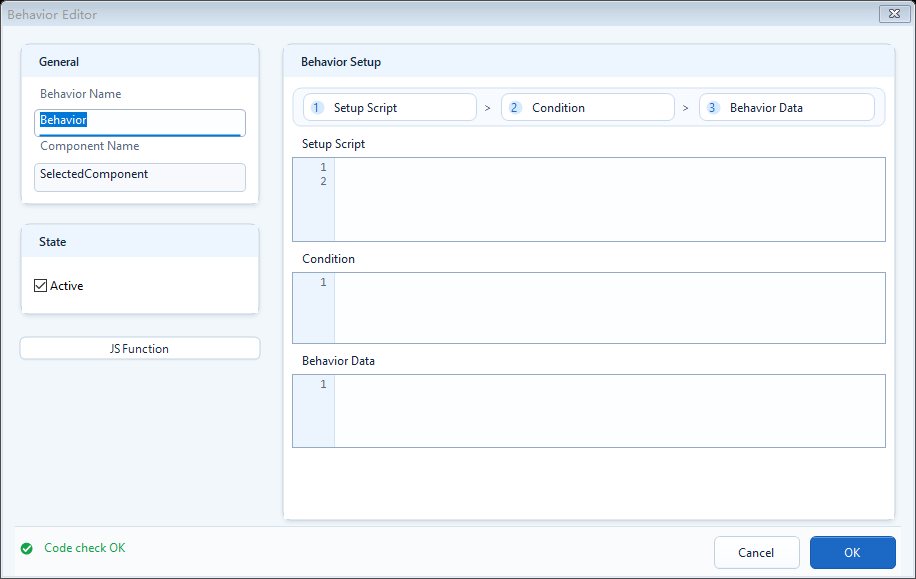
There is only one correct way to bind: select a component node in the left tree first, then drag the behavior you want from the right catalog onto that component node and release the mouse. Double-clicking a behavior on the right does NOT bind it; on double-click the status bar only shows Drag a behavior onto a component node to bind it. You must drag it across. Once bound, double-click that behavior node under the component in the left tree to open its editor and fill the fields. Fields differ per behavior; common ones are: Definition (the prep area; read tags, define variables, do intermediate math), Condition / Value / Text (the output that returns the value the behavior actually uses), Fill (fill color), Border (border color), Visibility (show/hide), Tag Expression (read-only tag expression), Target Tag (write target), Bit Index, and Action (Set / Reset / Toggle). The left-tree nodes also have a right-click menu: Locate in PowerPoint (find the page/component in PPT), Rename Component, Edit Behavior, and Remove Behavior.
- Binding steps: select the component on the left -> drag a behavior onto that component node -> release the mouse.
- Double-clicking a behavior on the right does not bind; double-clicking a bound behavior node on the left opens its editor.
- Definition: preparation (read tags, define variables, intermediate math).
- Condition / Value / Text: return only the final result; keep complex logic in Definition.
- Color behaviors, common fields: Fill, Border, Visibility.
- Write behaviors, common fields: Target Tag, Value, Bit Index, Action (Set/Reset/Toggle).
- Left-tree right-click: Locate in PowerPoint / Rename Component / Edit Behavior / Remove Behavior.
// After binding State Color to a pump shape, fill its editor like this:
// Definition (prep area)
var running = ReadTagBoolean("PLC1.PUMP.RUN", false);
// Output: Fill green when running, red when stopped
running ? "#22C55E" : "#EF4444"
Use the component-tree toolbar
The Components tree has five toolbar buttons. Refresh rereads the current presentation. Collapse all and Expand all control the tree. Zoom out and Zoom in adjust tree text and row size. Selecting a page or component node also selects the matching object in PowerPoint.
- The tree is behind PowerPoint: click Refresh.
- There are too many open nodes: Collapse all, then open only the target page.
- You need to review every behavior on the page: Expand all.
- Names are clipped or the list is too dense: use Zoom out / Zoom in.
- After selecting a component node, confirm the same object is selected on the slide.
Read the Bound, Unbound, Behavior, and Current legend
The legend distinguishes node states. Bound means that the behavior is attached to the component. Unbound means it is available in the catalog but not attached to the current component. Behavior identifies a behavior node. Current marks the active page, component, or behavior. Always confirm the result by checking whether the behavior appears under the component node.
- After a drag, confirm that a new behavior node appears under the component.
- Double-click the new node and confirm that its editor opens.
- Save, refresh once, and confirm that it still appears as Bound.
Use the context menu and keyboard shortcuts
Right-clicking a page, component, group, template, or behavior shows commands valid for that node: Locate in PowerPoint, Edit Template, Ungroup, Rename Component, Edit Behavior, Copy Behavior, Paste Behavior, and Remove Behavior.
- Ctrl+C: copy the selected behavior.
- Ctrl+V: paste the copied behavior onto the current compatible component.
- Delete: remove the selected behavior after confirmation.
- After a paste, recheck Target Tag, page targets, component names, and template variables.
- If a command is disabled, confirm the type of node currently selected.
Understand cancel rollback and text-target restrictions
Dragging a new behavior opens its editor immediately. If you click Cancel on that newly added behavior, the plugin rolls back the new binding. Cancel on an existing behavior only discards the current edits. Text behaviors can be dropped only on components that support text.
- Keep a new behavior: fill required fields and choose Save / OK.
- Discard a new behavior: choose Cancel and confirm no behavior node remains.
- Discard edits to an existing behavior: choose Cancel; the old configuration remains.
- A Text behavior is rejected: select a text box, text-capable shape, or supported template object.
- Tree and PowerPoint selection differ: Refresh, then use Locate in PowerPoint.
When to use it
Use it whenever a shape must change with live data, or must do something on click or hover. Two typical scenarios:
- Run-state lamp: find the pump/valve shape in the left tree, drag State Color or Blink Color onto it, then read the tag in Definition and set the color in the output.
- Click action: drag Write Tag / Write Tag Bit / Open Link onto a button shape, set the tag or the navigation target, and it works on click in the host after export.
Common mistakes
The most common mistake is double-clicking a behavior on the right and expecting it to bind. Double-clicking the right catalog only pops the hint Drag a behavior onto a component node to bind it.; it never binds; you must drag onto a component node on the left. Also: to bind to a component, drop onto the component NODE, not a page node. If you change a page, the selection, a template, or a behavior and the view does not update right away, click Refresh in the ribbon Tools group (or the browser's refresh) to re-read everything; no need to close and reopen.