
Manual
Chart templates: line, bar, gauge, and JSON charts
Choose a chart type from the Chart group in the Templates panel, insert it into the current PowerPoint page, then open Template Edit to configure the instance. The chart object is exported with the page and rendered by HQControl according to its configuration.
Charts: Chart templates: line, bar, gauge, and JSON charts
This section follows the actual setup order for chart templates: insert a chart from the Templates panel, configure position, size, data source, series fields, JSON field mapping, and appearance options in the template editor, then export to HQControl and verify the runtime result. Line Chart, Bar Chart, Gauge, and JSON Chart use different fields and should be configured by type.1. Insert a chart template
Choose a chart type from the Chart group in the Templates panel, insert it into the current PowerPoint page, then open Template Edit to configure the instance. The chart object is exported with the page and rendered by HQControl according to its configuration.
- Line Chart: continuous trend data, including multiple tag curves in one coordinate system.
- Bar Chart: current values or category comparison, usually multiple tags shown as bars.
- Gauge: one tag displayed against a range, such as pressure, temperature, level, speed, or percentage.
- JSON Chart: structured data supplied by a JSON tag, script, interface, or runtime variable.
- The Template area shows Instance, Template, and Group for type confirmation. Practical setup is done in Position and Size and Chart.
2. Configure position and size first
All chart types use Position and Size. These fields determine the exported runtime position and occupied area. Incorrect values can cause overlap, compression, or misalignment.
- X and Y: the top-left coordinate of the chart on the page. Align them with titles, buttons, frames, and nearby objects.
- Width and Height: the rendered size. Line and bar charts need enough room for axes, legends, and labels.
- When placing charts side by side, keep heights or baselines consistent.
- After resizing, check that title, legend, axis labels, and tooltip space are not clipped.
3. Configure Line Chart
Line Chart uses the Series table. Each row is one curve. At runtime the chart reads the configured tag and uses Name, Color, Unit, and Precision for display.
- Chart Name: title text displayed when Title is enabled in Appearance.
- Name: series label shown in legend or tooltip. Use short names that operators can recognize.
- Tag: data source for the curve. It must be a confirmed project tag with numeric values.
- Color: line color. Multiple curves should use visually distinct colors.
- Unit: optional unit text. Keep it consistent with the tag definition.
- Precision: decimal places. For example, 1 means the runtime displays one decimal place.
- Add / Remove: add or remove series rows. Confirm the curve is not required before removing it.
- Appearance: Title, Legend, and Grid control title, legend, and grid lines.
4. Configure Bar Chart
Bar Chart uses the Tags table. Each row usually represents a category bar or a current value. It is better for current-state comparison than long time trends.
- Chart Name: title text. Name the comparison target, such as equipment, line, shift, or area.
- Name: bar category or series label used by the x-axis, legend, and tooltip.
- Tag: bar value source. Tags in one chart should use comparable units and meanings.
- Color: bar color. Use consistent colors for similar items and accent colors only for emphasis.
- Unit: value unit. Do not compare different units in one bar chart unless the chart is intentionally normalized.
- Precision: display precision. Counts usually use 0; analog values follow the project requirement.
- Advanced JSON: use only when bulk editing or direct JSON configuration is required. Standard table fields should be preferred for normal setup.
5. Configure Gauge
Gauge binds one tag. The key fields are range, display precision, and color. It is suitable for one important process value, such as temperature, pressure, level, speed, or percentage.
- Chart Name: gauge title used to identify the metric on the runtime screen.
- Tag: the single numeric tag read by the gauge.
- Min and Max: range limits. Use the process allowed range or presentation range, not only the current observed value.
- Unit: unit text, such as C, MPa, %, or rpm. Keep it consistent with the field tag.
- Precision: displayed decimal places, commonly 0, 1, or 2.
- Color: the main gauge color. Use the Color button and keep exception colors aligned with the project color rules.
- Appearance: Title controls the title. Legend and Grid are usually not primary gauge options.
6. Configure JSON Chart fields
JSON Chart reads data from a JSON tag and maps fields into axis, series, and value roles. Field names must match the runtime JSON exactly, including letter case.
- JSON Tag: the JSON point or variable that holds chart data, for example A2.ChartData.
- Time Field (X): horizontal time field, commonly ts. Use a stable format such as 2026-07-06T10:48:54+08:00.
- Series Name Field: series field, commonly series, used to distinguish lines or groups.
- Value Field (Y): numeric value field, commonly value. The value must be convertible to a number.
- Appearance: Title, Legend, and Grid control title, legend, and grid lines. During debugging, keep them enabled, then adjust for delivery.
- When the JSON structure changes, update the field mapping at the same time to avoid empty charts, missing axes, or empty tooltips.
{
  "rows": [
    {
      "ts": "2026-07-06T10:48:54+08:00",
      "series": "A2 JSON",
      "value": 18,
      "color": "#2563EB"
    },
    {
      "ts": "2026-07-06T10:49:54+08:00",
      "series": "A2 JSON",
      "value": 44,
      "color": "#2563EB"
    }
  ]
}

JSON Tag: A2.ChartData
Time Field (X): ts
Series Name Field: series
Value Field (Y): value
7. Directly edit Advanced JSON
When Edit JSON directly is enabled, the editor shows three JSON areas: Data Source JSON, Field Mapping JSON, and Appearance JSON. Use this mode for bulk maintenance, copied configuration, or extension parameters that are not covered by the standard fields. Prefer standard fields for normal setup.
- Data Source JSON: defines data source, refresh cycle, tag list, or JSON tag, such as kind, refreshMs, tags, tagName, and shape.
- Field Mapping JSON: maps runtime fields, such as time, category, series, and value.
- Appearance JSON: controls display switches, such as titleVisible, legendVisible, and gridVisible.
- Keep the JSON valid. Property names and string values must use straight double quotes.
- Copy the current JSON as a rollback version before saving, then verify the runtime rendering in HQControl.
{
  "version": 1,
  "kind": "variable-json",
  "refreshMs": 1000,
  "tagName": "ChartData",
  "shape": "rows"
}

{
  "time": "ts",
  "category": "category",
  "series": "series",
  "value": "value"
}

{
  "titleVisible": true,
  "legendVisible": true,
  "gridVisible": true
}
8. Pre-export checklist
After chart setup, export the screen package and load it in HQControl to check the real runtime result. Saving configuration in PPT does not guarantee that runtime data sources, fields, and permissions are already available.
- The chart is not empty: the tag or JSON tag can be read at runtime and has the expected data type.
- Fields match: JSON Chart Time Field, Series Name Field, and Value Field exactly match the JSON payload.
- Values display correctly: unit, precision, range, and colors follow the project convention.
- Layout does not overlap: title, legend, axes, tooltip, and nearby buttons or text remain readable.
- Refresh behavior is expected: real-time curves, bars, and JSON charts refresh according to project requirements; missing or abnormal values are acceptable.
- Delivery is traceable: record tags, JSON tags, field mappings, and Advanced JSON used by each chart.
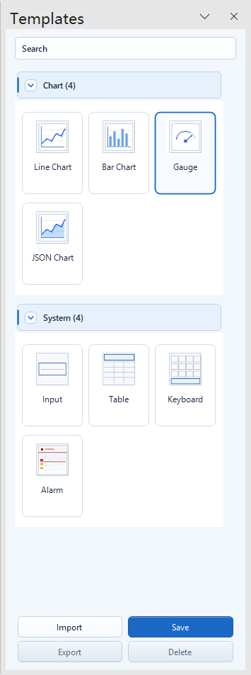
Choose the chart type from the Chart group in the Templates panel, then open Template Edit for instance configuration.
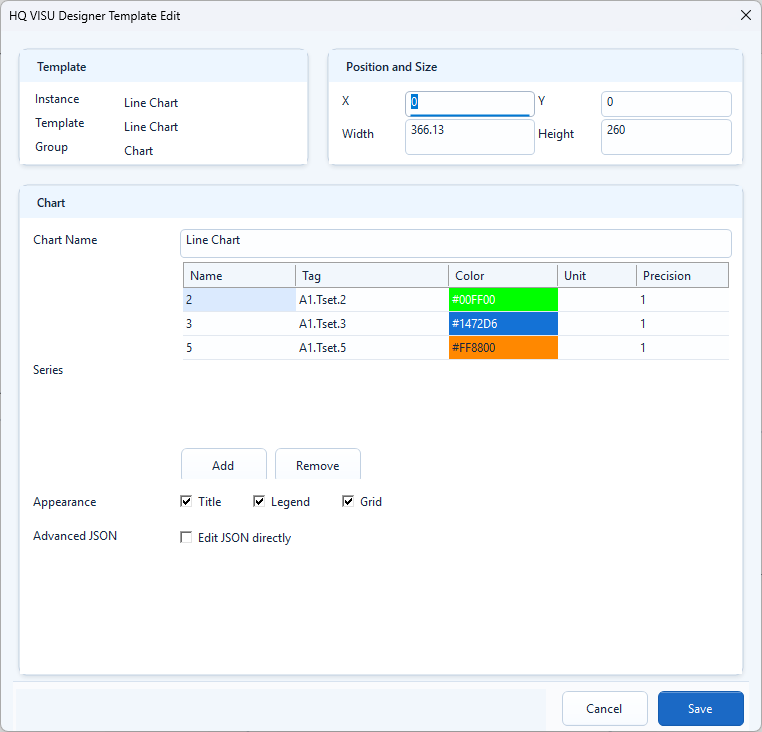
Each Series row is one curve: Name controls the display label, Tag supplies the value, and Color, Unit, and Precision control presentation.
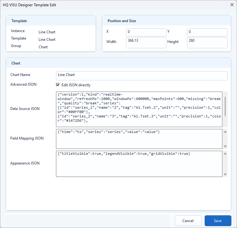
Direct edit mode separates data source, field mapping, and appearance into three JSON blocks for copied configuration or extension parameters.
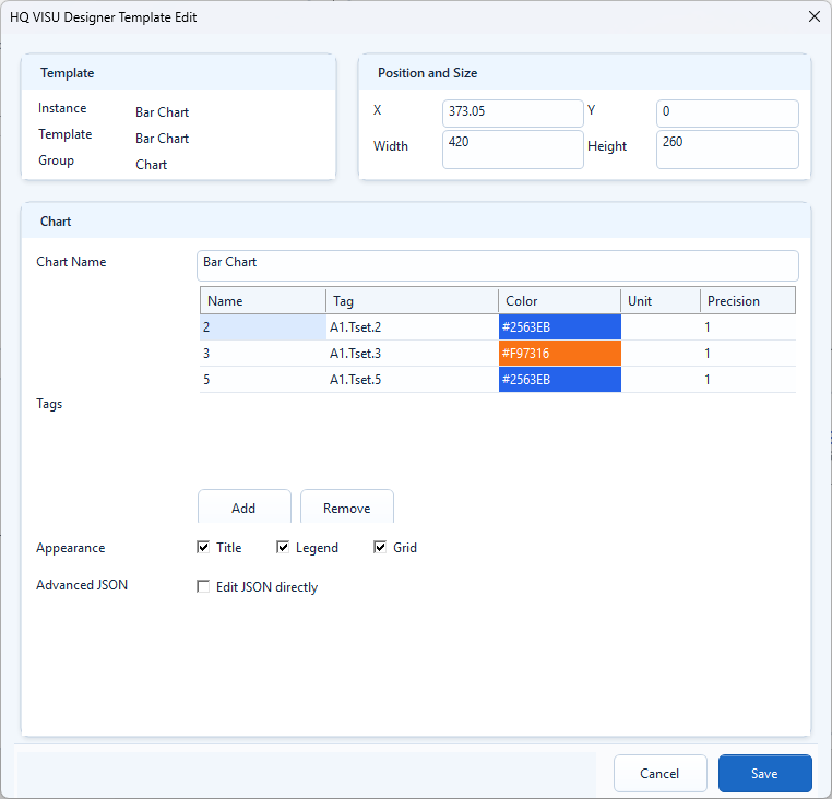
Bar Chart binds categories or current values through the Tags table; units and meanings should stay comparable in one chart.
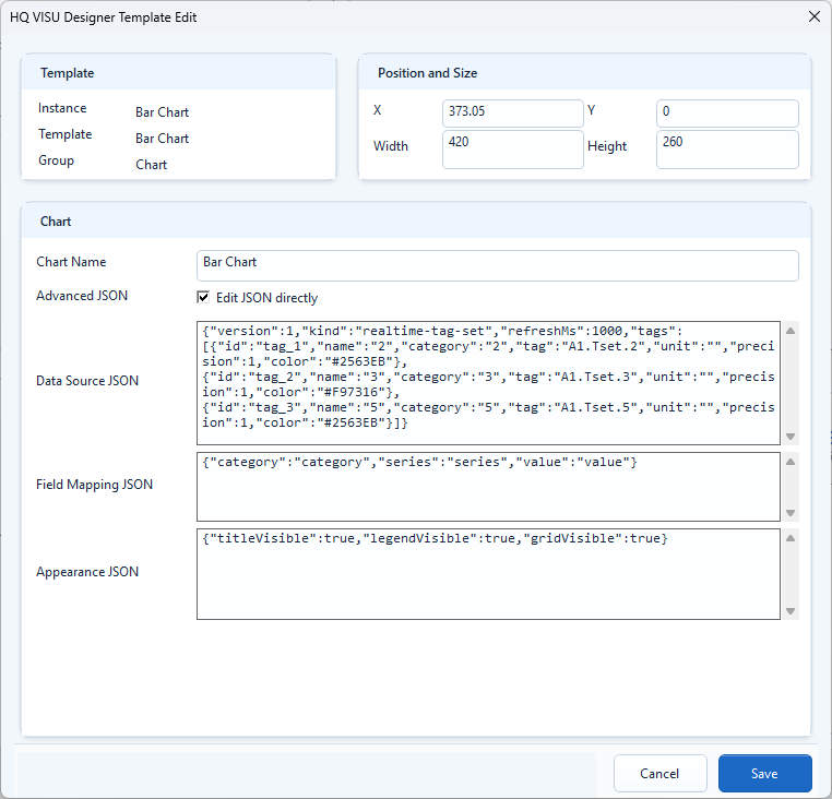
Advanced JSON can define a real-time tag set, category field, series field, and value field. Validate the JSON before saving.
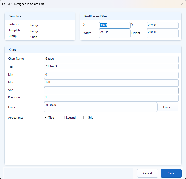
Gauge binds one tag. Min and Max define the range, while Unit, Precision, and Color define the value presentation.
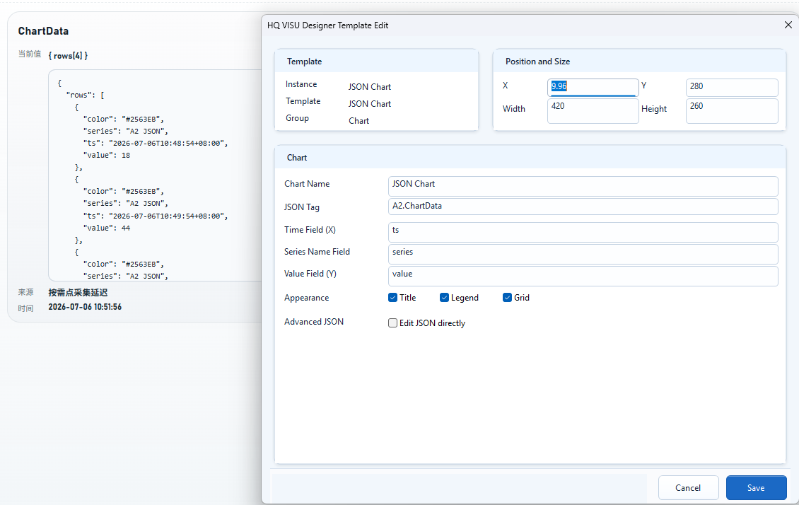
JSON Tag points to structured data. Time Field, Series Name Field, and Value Field must match the JSON payload.
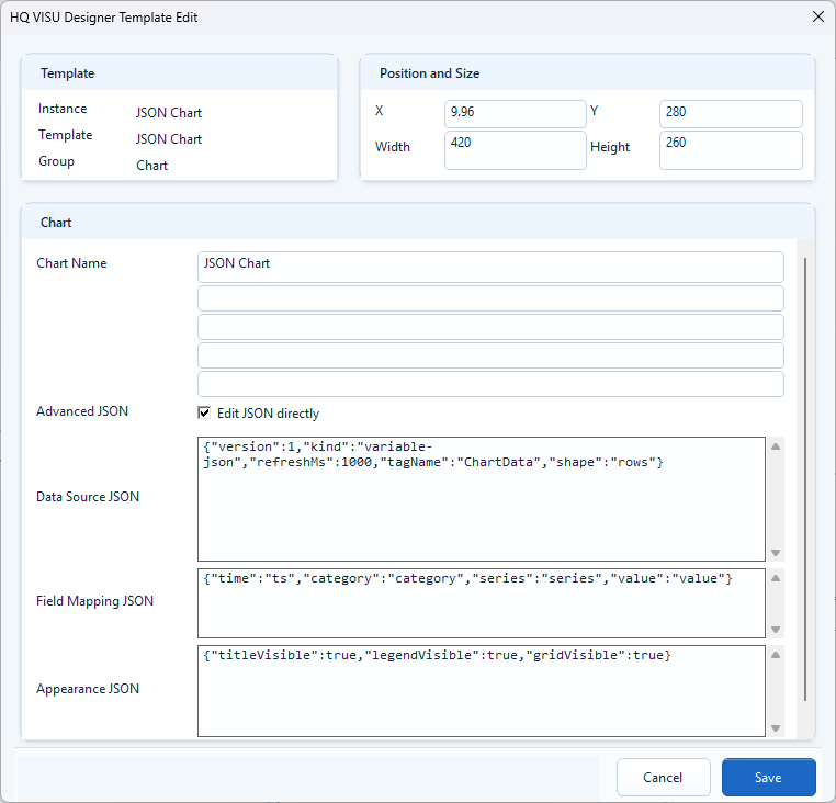
Advanced mode defines tagName, shape, field mapping, and appearance switches for data supplied by scripts or variables.
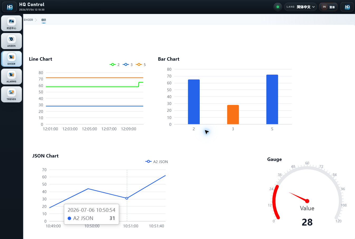
After export, verify line, bar, JSON, and gauge rendering in HQControl.